Web 1.0
In the evolution of the World Wide Web, Web 1.0 refers to the first stage. With a huge majority of users who are content consumers, there were only a few content creators in Web 1.0. Personal web pages were normal, hosted on ISP-run web servers consisting mainly of static pages, or on web hosting services.
Advertisements on Web 1.0 were banned while surfing the internet. Web 1.0 enables to showcase of the piece of information on the websites which is known as Content Delivery Network (CDN) also can be used as personal websites. Cost formula is per page view and it has directories that enable users to retrieve a particular piece of information.
Design Essentials of web 1.0
- Pages are static.
- From the file-system of the server, the content is served.
- Using Common Gateway Interface (CGI) or Server Side the page sare built.
- To position and align the Elements, frames and tables are used on a page.
Web 2.0
User-generated content, usability, and interoperability for end-users are some of the highlights of Web 2.0 which is also known as a worldwide website and another name for it is a participative social web. It doesn’t refer to any modification to technical specification, but to recreate in a good way web pages are designed and used. When the changes have occurred the transitions are beneficial, but it doesn’t seem that way. Collaboration is allowed with each other by Web 2.0 in a social media dialogue as the creator of a user-generated cant in a virtual community. Web 1 is an enhanced version of 2.0. In web 2.0 development the browser technologies are used, and it includes ajax and JavaScript Frameworks.
Features of Web 2.0
- It permits users to retrieve and classify the information collectively, and it also provides free sorting of information.
- It provides dynamic content that is responsive to user input.
- By means of evaluation and online commenting, information flows between site owners and site users.
- APIs are developed to allow self-usage, such as by a software application.
- Web access leads to an issue different from the traditional user base to a wider variety of users.
Related Post: Types of hackers & current scenario among the types of hackers
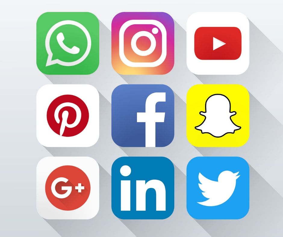
Use of Web 2.0
To share the perspectives, thoughts, opinions, and experiences the social web contains a number of online tools. Web 2.0 applications tend to have a conversation much more with the end-user. The end-user is also a participant of the 8 tools mentioned below:
- Podcasting
- Blogging
- Tagging
- Curating with RSS
- Social Bookmarking
- Social Networking
- Social media
- Web content voting
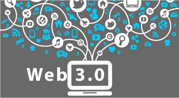
Web 3.0
The evolution and utilization of web interaction with the inclusion of alteration of the web into the database. After a long time of focus on the front-end, it enables the upgradation of the back-end of the web. To describe the evolutions of web usage and interaction among several paths web 3.0 is used. Instead of owning data, it is shared, where services show different views for the same data / same web. All the development process is done in Web 3.0, and all the Website Development Companies uses Web 3.0 for the website designing services.
Establishments of “the world’s information” is promised by the semantic web (3.0) in a responsible way than Google can ever attain with their existing engine schema. From the perspective of machine conception, this is particularly true as opposed to human understanding. It is necessary for the semantic web for the use of a declarative ontological language like OWL to produce domain-specific ontologies that machines can use to reason about information and use it make new conclusions, and not simply match keywords.
Features of Web 3.0
Semantic Web
There is an involvement of the semantic web in succeeding in the evolution of the Web. In order to create, share and connect through search and analysis based on the capability to comprehend the meaning of words, instead of keywords or numbers, al this is used in the development of and improvement of the semantic web.
Artificial Intelligence
Mixing this capability with natural language processing, computers can distinguish information like humans in order to provide faster and more relevant results in web 3.0. to fulfill the requirements of the user it becomes more and more intelligent.
Related Post: Why Businesses must Integrate Artificial Intelligence[AI]?
3D Graphics
In Web 3.0 the three-dimensional design is being used widely in websites and services. Computer games, museum guides, eCommerce, geospatial contexts, etc. are some of the examples that use 3D graphics.
Connectivity
Thanks to semantic metadata, the information is more connected to web 3.0. As a result, the UI evolves to another level of connectivity that leverages all the available information.

Ubiquity
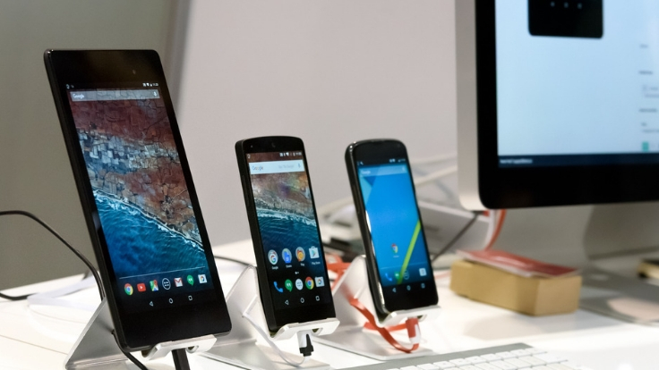
The services can be used everywhere, content is accessible by multiple applications. Every device is connected to the web.
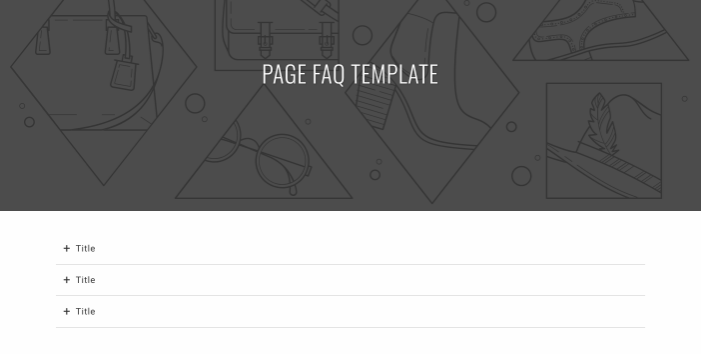
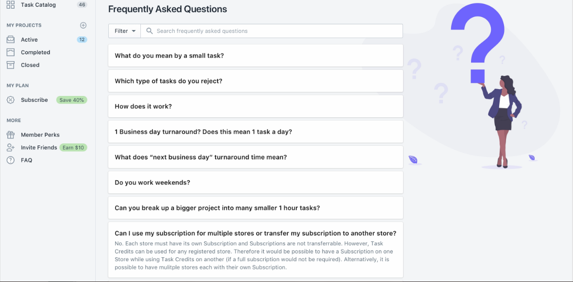
Ouriken is a standalone web design and digital agency. We design and implements powerful solutions for small and medium businesses in technology, business, and operations. Our standard web designing services include many features that contain home, blog, images, faq, contact us and many more. It is the best website designing firm.


